Standing in front of a paint shade card with forty tiny squares of near-identical beige, trying to imagine how it’ll actually look on a 12-foot wall — we’ve all been there. A good two colour wall combination can completely change how a room feels, but picking one from a tiny swatch is genuinely hard. Colors behave differently once they’re scaled up, hit by sunlight through a window, or sitting next to your existing furniture.
I’ve repainted my own living room three times over the years chasing the “right” combination, so trust me, I get the indecision. Let’s go through combinations that actually hold up in real homes, not just in showroom lighting.
Why Two Colours Work Better Than One Flat Shade
A single flat color across every wall can feel monotonous, especially in open-plan Indian homes where the living, dining, and kitchen areas often flow into each other. A two colour combination breaks up that flatness and adds depth without needing texture paint or wallpaper.
It also solves a practical problem — most Indian living rooms have an accent wall behind the sofa or TV unit anyway, so you’re already halfway to a two-tone scheme whether you planned it or not.
Neutral and Bold — The Safest Starting Point
If you’re nervous about commitment, this combination barely ever goes wrong.
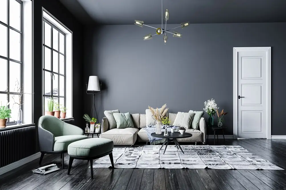
Pair a warm white, cream, or light grey on three walls with a bolder shade — deep teal, mustard, or terracotta — on the accent wall. It gives you room to be a little adventurous with the accent color since the neutral walls balance it out. I’d lean toward Asian Paints’ “Tuscany” or “Cardamom Green” for the bold wall if you want something that photographs well but doesn’t scream trendy in five years.
Two Colour Wall Combinations for Small Rooms
Here’s a quick answer for anyone working with tight square footage: for small rooms, pick two shades from the same color family (like sage green and off-white) rather than high-contrast pairs, since contrasting darker tones on multiple walls can make a compact room feel boxed in and visually smaller.
Picture a young couple’s first apartment in Pune, a single bedroom under 120 square feet. They went with light blue and white in a horizontal split, and it genuinely made the ceiling feel higher than it actually was. Small tweaks like that matter more than people expect.
Horizontal Split vs Accent Wall — Which Approach Fits Your Space?
There are really two ways to apply a two colour wall combination: a horizontal split (one color on the lower half, another above, usually divided by a border or moulding) or a single accent wall in a different shade from the rest.
- Horizontal splits work best in rooms with high ceilings — they visually lower the ceiling a touch and add a cozy, layered feel
- Accent walls suit rooms where you want to highlight a specific feature, like a bed headboard or TV unit
- Horizontal splits need more precise masking tape work during painting, so budget a bit more labor time for this method
- Accent walls are far easier for a DIY paint job over a weekend
Honestly, I lean toward accent walls for most Indian homes. Horizontal splits look sharp in photos but need near-perfect execution, and an uneven border line ruins the whole effect fast.
Living Room Two Colour Combinations That Hold Up Over Time
For the living room, where guests spend the most time, go with combinations that don’t feel dated in three years.
- Warm grey with a mustard yellow accent wall — pairs well with wooden furniture and brass fixtures
- Off-white with a deep navy accent — works particularly well if you’ve got a lot of natural light coming in
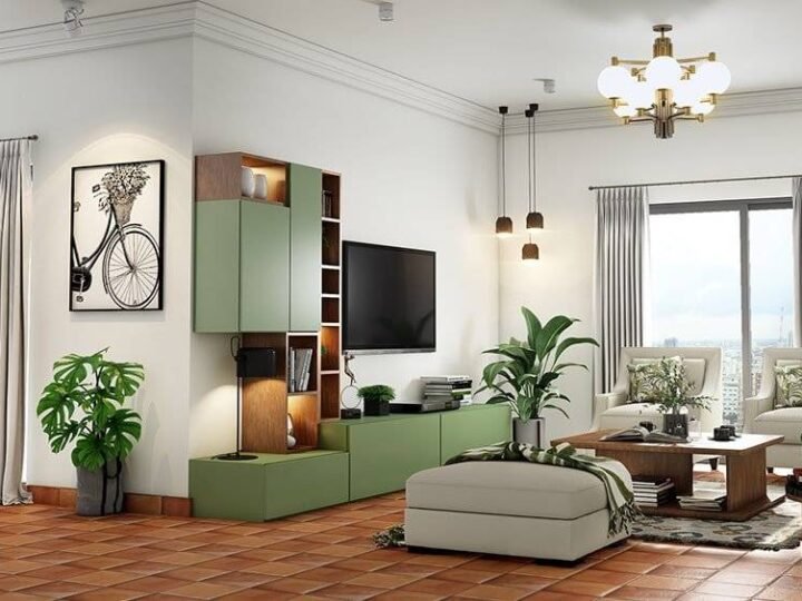
- Sage green with cream — softer, calmer, and forgiving of a wide range of furniture colors
- Terracotta with warm white — leans traditional, suits homes with Rajasthani or Jaipur-style decor elements
I’ll admit a mild bias here: I’m not a fan of grey-and-yellow combinations that were everywhere around 2018. They still show up in a lot of paint brand catalogs, but they read as dated now if you’re going for something that feels current in 2026.
Bedroom Colour Pairings for a Calmer, Restful Feel
Bedrooms need a slightly different logic than living rooms — you’re not decorating for guests, you’re decorating for sleep and mornings.
Muted, low-saturation pairs work best here. Dusty pink with warm grey, powder blue with off-white, or sage green with a soft taupe all create a calm backdrop without feeling flat or boring. Avoid high-contrast combinations like black and white or deep red and cream in bedrooms — they’re visually stimulating, which works against you right before sleep.
Kitchen and Dining Wall Colour Ideas
Kitchens can handle bolder pairings since they’re functional spaces used in shorter bursts throughout the day rather than lived in constantly.
Bottle green with white gives a fresh, almost cafe-like feel, and it hides splatter marks better than pure white ever will. Coral with cream works nicely in dining areas that get good natural light. [link to a related guide on kitchen colour schemes here] For open kitchen-dining layouts, try to keep one color consistent across both zones so the transition doesn’t feel jarring.
How to Actually Test a Colour Combination Before Committing
Don’t trust the tiny paint chip. Buy sample pots — most brands sell 200ml testers for ₹80 to ₹150 — and paint a patch at least 2 feet by 2 feet directly on your wall.
Check it at three different times of day: morning light, afternoon, and evening under artificial lighting. Colors shift more than people expect under warm yellow bulbs versus cool white LED lights. Has a paint color ever looked completely different once you got it home from the shop? That’s exactly why the patch test matters more than any online color visualizer tool.
FAQ: Common Questions About Two Colour Wall Combinations
What is the most popular two colour wall combination in India right now? Warm grey paired with a bold accent shade like mustard, teal, or terracotta remains the most requested combination among interior designers, mainly because it’s flexible enough to match most furniture styles already in a home.
Can I use two colour combinations in a rented flat? Yes, though it’s worth checking your rental agreement first. Many landlords are fine with an accent wall as long as you repaint it back to a neutral shade before moving out.
Which colour combination makes a room look bigger? Lighter, low-contrast pairs from the same color family, like off-white and pale sage, tend to make a room feel more spacious than high-contrast dark and light combinations.
Should the ceiling match one of the two wall colours? Usually the ceiling stays white or a very light neutral regardless of the wall combination, since a colored ceiling can make the room feel lower and heavier than it actually is.
How much paint do I need for a two colour wall combination in a standard room? For an average 120 sq ft bedroom, expect to need roughly 2 to 3 litres of each color for two coats, though this varies with wall texture and the paint brand’s coverage rating.
Is it okay to mix matte and glossy finishes on the two colours? Yes, that’s actually a nice way to add subtle contrast even between similar shades — a matte base with a satin or gloss finish on the accent wall catches light differently and adds depth.
Final Thoughts
Picking the right two colour wall combination comes down to matching the mood you want with the room’s actual light and furniture, not just chasing whatever’s trending. Neutral-and-bold pairs are the safest bet if you’re unsure, while same-family tones work best for smaller spaces.
Before you commit to a full room, grab a couple of sample pots this weekend and paint some real patches on the wall. It costs less than ₹500 total and saves you from repainting an entire room because the color looked different in the shop